jeroen koolhaas | BEAUTIFICATION
article by Giampiero Sanguigni
Jeroen Koolhaas and Dre Urhahn (Haas & Hahn) focus their attention on the city and its inhabitants, activating collective phenomena aimed at reappropriating complex and problematic sites. Through participative action their largescale interventions seek to reveal the identity of a neighbourhood or a street, demonstrating to local inhabitants the inherent possibilities of a shared approach and cooperative change. Through ephemerality, their often superficial operations – mural paintings – dig deep into the collective consciousness of
a neighbourhood.
Their intent is not cosmetic, focused solely on altering the external image of parts
of the city, but is aimed at triggering a new perception of everyday space and stimulating faith in the spirit and potentialities of the community that inhabits it.
For this reason Haas & Hahn tend to focus on bipolar cities, in which wellbeing
and marginalization coexist, immersing themselves in the reality of their most problematic neighbourhoods.
Since 2006 the duo has concentrated its attention on the favela of Vila Cruziero, in the Complexo da Penha (Rio de Janeiro), creating several favela paintings, such as a 150 square metre mural of a child, flying a kite, and
a large drawing of a traditional Japanese image superimposed on an existing concrete structure.
They subsequently worked in the favela of Santa Marta, with a painting in urban scale that transformed the entrance square to the favela, once dangerous and abandoned, into a space used by the public. In all cases their interventions were achieved with the help of young local people, who were remunerated
while learning the techniques necessary
to bring these works to life.
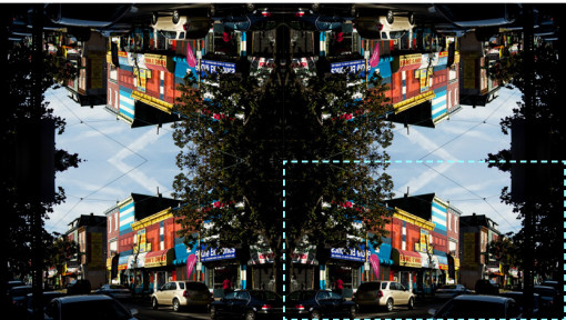
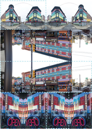
In 2011 the Dutch duo was invited by the Mural Arts Program of Philadelphia to work in an area in the north of the city, Germantown Avenue, to rehabilitate this once successful commercial area, offering local residents the chance to identify themselves with their surroundings.
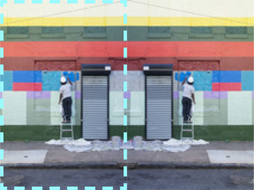
The area, as in the case of Santa Marta, has a considerable extension: the work includes more than 50 buildings. Existing architectures were mapped and reproduced in a scale model; each urban facade was linked to a colour palette and characteristic motifs that were achieved with the help of local residents and investors.
The choice of facades on which to intervene followed a social and communicative strategy: painting was not limited to the buildings located on the main road, but was extended mainly to the smaller orthogonal roads, in order to extend the project, effectively, to the entire neighborhood.
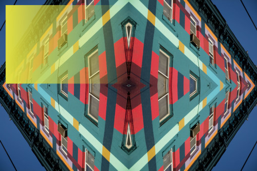
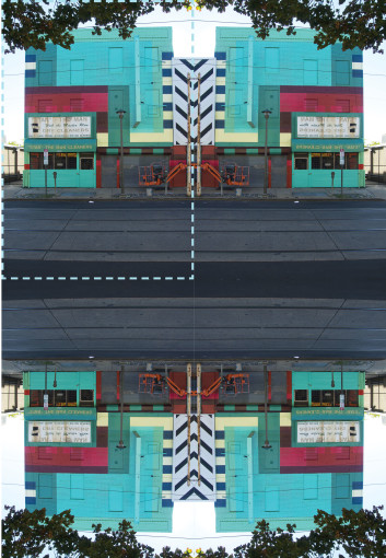
Street facades have thir own codes, heights and styles, but a common commercial ground floor. Haas & Hahn have cataloged the prevailing urban colors in the northern part of Philadelphia (decorations, signs, murals) and created a sequence of color palettes which were then submitted to the judgment of residents and shop owners. The output is a colored puzzle, discontinuous, partly resulting from the peoples taste, partly standardized by the choice of flexible patterns, based on a mesh made of polygons (made of rectangles and squares).
The aim of this brightly coloured intervention is more social than artistic: Philly Painting seeks to create a sense of belonging and recognition.
The idea postulated by Haas & Hahn is that once the work is complete what remains is not the painting as such, but the inhabitants’ awareness of living in a place where change is possible.
All staff members who created the work are local women and men, which over time have learned useful skills in order to achieve it: maneuver a mechanical lift, paint and blend colors, restore portions of facades.
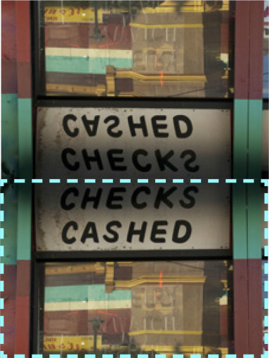
“Philly Painting” is described on www.phillypainting.org as an intervention of “beautification”. It is an important statement, because it doesn’t underline the concept of aesthetics as linked to the taste of the two promoting artists, but as a customization that follows the idea of a common beauty, that is nested in the same community that created the work.
The color has become an emblem of rebirth for the neighbourhoods, the sympton of a transition from an urban landscape made up of shades of gray and a uniform marginalization, to a new state of consciousness, in which the different stories of the protagonists met in a colorful joint venture.
The use of bright colors greatly emphasizes this sense of change. Anyone crossing Germantown is surrounded by murals and polychrome textures that invade everything – windows, cornices, – by removing the distinction between the individual units it gives the idea of a defined place and community. The bright colors trigger kaleidoscopic effects in the windows, illuminating the shaded part of the road with sharp reflections.
The size of the project and the field of application – the neglected districts -, create a parallel with the work of Matta-Clark.
While the American artist intervened on existing buildings intended to be demolished or renewed, removing portions of the interiors and putting in communication spaces once private, the Dutch duo, that limit their work to the sufaces, look for a depth that is not physical but social, opening up possibilities and giving visibility to a situation otherwise hidden by the contingencies. Matta-Clark and Haas&Hahn have in common the scale and context with which they have chosen to work: both seek to change the point of view, focusing on places where phenomena are stratified by time and urban dynamics, performing operations that can hardly be shown in a contemporary art gallery, and that can not be fully described, without a double vision, in live and translated time – the status quo and the transformation – and without a direct inspection of the part of the city in which they chose to intervene.
But if the creations of the American artist were mainly hidden and illegal, Haas & Hahn can not be separated from the visibility, communication and dialogue with residents. At the end their favorite media are not the objects in their existing state of decay, but the people, their desire for redemption, their desire to leave a tangible record of the identity of the place in which they live.
ITALIAN VERSION _____________________________________________
Jeroen Koolhaas e Dre Urhahn
(Haas & Hahn) focalizzano la loro attenzione sulla città e sui suoi abitanti, innescando fenomeni collettivi di riappropriazione di luoghi dal carattere complesso e problematico.
I loro interventi a grande scala cercano di far emergere, attraverso un’attività partecipata, l’identità di un quartiere e di una strada, mostrando agli abitanti le possibilità insite nel lavoro condiviso e nel cambiamento concertato.
Si tratta di operazioni spesso superficiali – pitture murali – che, attraverso l’effimero, scavano in profondità, nella coscienza collettiva di un quartiere.
L’intento non è quello di una cosmesi,
del cambiamento esteriore dell’immagine di una parte di città, ma quello di innescare una nuova percezione dello spazio quotidiano e di stimolare la fiducia nello spirito e nelle potenzialità della comunità che lo vive.
Nel 2006 il duo Haas&Hahn ha concentrato la sua attenzione su Vila Cruzeiro, una delle principali favelas del Complexo da Penha a Rio de Janeiro, realizzando diversi interventi, tra i quali un murale di
150 mq raffigurante un bambino nell’atto di far volare un aquilone e un grande dipinto orientaleggiante, sovrapposto ad una struttura in cemento preesistente. Successivamente sono intervenuti nella favela di Santa Marta, con un’opera pittorica a scala urbana che ha trasformato la piazza d’ingresso alla baraccopoli, un tempo malfamata e abbandonata, in uno spazio riconquistato e collettivo.
In entrambi i casi gli interventi sono stati realizzati con l’aiuto dei ragazzi dei quartieri, retribuiti mentre apprendevano le tecniche necessarie alla loro realizzazione.
Nel 2011 il duo olandese è stato invitato
dal Mural Arts Program di Philadelphia per intervenire in una parte a Nord della città, Germantown Avenue, in modo da restituire al quartiere i fasti del suo passato commerciale, consegnando alla comunità esistente un luogo in cui fosse possibile riconoscersi. L’area, come
nel caso di Santa Marta, ha un’estensione ragguardevole, l’intervento comprende più di 50 edifici.
Le architetture esistenti sono state mappate e riprodotte in scala; per ogni fronte urbano sono stati immaginate delle palette cromatiche e dei motivi caratterizzanti che sono poi stati messi in opera con il contributo degli abitanti e degli investitori locali. La scelta delle facciate sulle quali intervenire ha seguito una strategia sociale e comunicativa: la pittura dei fronti non è stata limitata agli edifici posti sulla strada principale, ma si è estesa principalmente alle strade minori, quelle ortogonali, in modo da estendere il progetto, in maniera effettiva, all’intero quartiere.
Le facciate su strada hanno codici, altezze e stili diversi, ma posseggono tutte un piano terra commerciale. Haas&Hahn hanno catalogato i colori prevalenti sulle facciate degli edifici della parte Nord di Philadelphia (decorazioni, insegne, murales) e creato una sequenza di palette cromatiche che sono state poi sottoposte al giudizio degli abitanti e dei proprietari dei negozi. Ne è scaturito un puzzle cromatico discontinuo, in parte derivante dal gusto delle persone, in parte uniformato dalla scelta di patterns flessibili, basati su una maglia di poligoni regolari (fatta di rettangoli e quadrati). L’intervento, dai colori sgargianti, ha un’intenzionalità sociale prima ancora
che artistica: cerca di creare un senso di appartenenza e di riconoscimento. L’idea di Haas&Hahn è che, una volta terminata l’operazione, quello che resta non è la pittura in sé, ma la consapevolezza degli abitanti di vivere in un quartiere in cui
il cambiamento è possibile.
Tutti i membri dello staff che ha realizzato l’opera sono uomini e donne del luogo, che hanno nel tempo sviluppato le conoscenze necessarie al completamento del lavoro: manovrare un elevatore meccanico, dipingere e miscelare i colori, restaurare le porzioni di facciata deteriorate.
“Philly Painting” è descritto nel sito che racconta la storia del progetto (www.phillypainting.org) come un intervento di “beautification”. É una precisazione fondamentale, perché non parla di un’estetica legata al gusto dei due artisti promotori, ma di una personalizzazione che segue l’idea comune del bello, quella condivisa dalla comunità che ha realizzato l’opera e che sarà destinata a usarla e viverla negli anni successivi.
Il colore è diventato il segno distintivo della rinascita e di un quartiere, del passaggio da un paesaggio urbano fatto di toni di grigio e di una emarginazione uniforme, ad un nuovo stato di coscienza, in cui le diverse storie dei protagonisti si sono incontrate in un’impresa comune, variopinta.
L’uso dei colori sgargianti enfatizza notevolmente questo senso di cambiamento. Chi attraversa Germantown si trova avvolto da murales policromi e texturizzanti che invadono tutto – gli infissi, i cornicioni, facendo scomparire la distinzione tra le singole unità immobiliari e prevalere l’idea di un luogo definito e comunitario. I colori vivaci innescano effetti caledoscopici nelle vetrine, quando, in un prospetto in ombra, si riflette la luce del fronte stradale antistante, illuminandolo.
La dimensione del progetto e il relativo abbandono del quartiere in questione, ricorda il Bronx in cui Matta-Clark realizzò parte dei suoi lavori.
Mentre l’artista americano interveniva su un esistente destinato al cambiamento o alla demolizione, asportando porzioni di interno e mettendo in comunicazione spazi un tempo privati; il duo olandese, che si limita all’intervento sulle superfici, cerca una profondità che non è fisica ma sociale, aprendo possibilità e restituendo una visibilità altrimenti soffocata dalle contingenze. Matta-Clark e Haas&Hahn sono accumunati dalla scala e dal contesto con cui hanno scelto di lavorare: entrambi cercano di cambiare il punto di vista rispetto a delle condizioni stratificate dal tempo e dalle dinamiche urbane, compiendo operazioni che sono difficilmente trasportabili in una galleria d’arte contemporanea, e che non possono essere pienamente descritte, se non attraverso una doppia visione, dal vivo e traslata nel tempo – il prima e il dopo -, della parte di città in cui hanno scelto d’intervenire.
Ma se per l’artista americano la parte produttiva del proprio lavoro era principalmente clandestina, per Haas&Hahn la realizzazione dei murales non può essere svincolata dalla visibilità, dalla comunicazione e dal dialogo con i residenti. In fondo il loro media preferito, uno strumento relativamente gestibile, non sono gli oggetti nel loro stato di degrado preesistente, ma le persone, la loro voglia di riscatto e di appropriarsi, lasciando una traccia tangibile, dell’identità del luogo in cui vivono.
www.favelapainting.com/haas-hahn
Related Posts :


Category: Article
Views: 4467 Likes: 0
Tags: Giampiero Sanguigni , Haas & Hahn , jeroen koolhaas , Philly Painting , Sick & Wonder
Comments:
Info:

Info:
Title: jeroen koolhaas | BEAUTIFICATION
Time: 21 settembre 2013
Category: Article
Views: 4467 Likes: 0
Tags: Giampiero Sanguigni , Haas & Hahn , jeroen koolhaas , Philly Painting , Sick & Wonder